
Posted on October 1, 2026
Some Thoughts On Maps
Or: How I Learned to Stop Worrying and Love the Herndon Shaped Hole
True story about me and maps: my dad used to lock me and my siblings individually in the computer room until we had done a set number map quizzes, because he was determined that we would love geography as much as he did.1If you’re confused by “map quiz” they were basically online quizzes where you had to identify countries/rivers/states/capital cities on a map. For reasons you might be able to imagine, this tended to have the opposite effect, but it did help me learn a lot about geography very quickly. I might not love geography and maps the way my father does, but I suppose I can at least tell you that the capital of Bosnia and Herzegovina is Sarajevo.
I suppose my point in telling you this is to say that maps and I have a bit of a complicated past. To wit, though, we should approach historical GIS with a nuanced eye. GIS is an incredibly powerful tool for studying, communication and visualization, but it also a tool that needs to be applied with care and discernment.
On Monday, in class, I used QGIS for the first time. Though the initial appearance was rather intimidating (I was reminded somewhat of the UI complexity of Blender, which I have tried and failed several times to learn), it became much easier once we identified the primary controls and started manipulating data and labels in SQL terms, something I’m much more comfortable with.
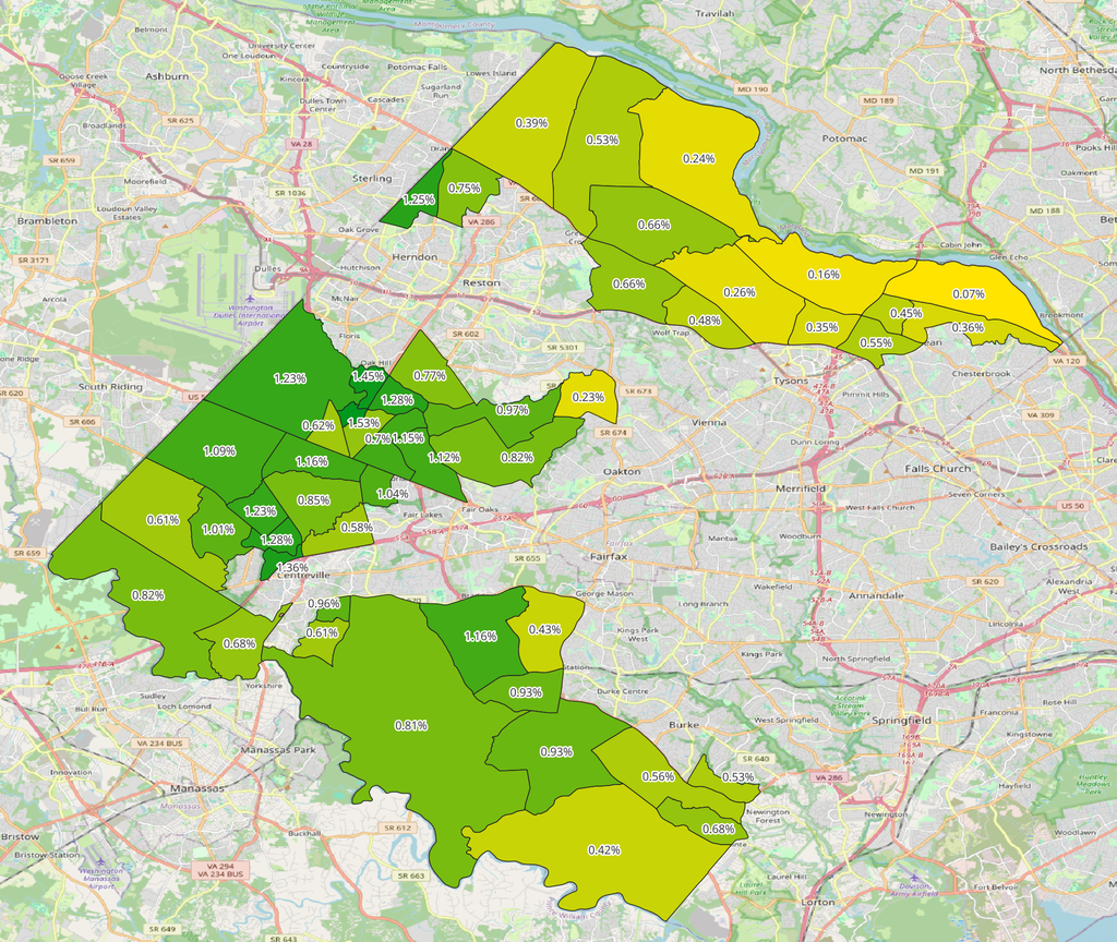
There are a number of limitations to consider when performing QGIS work, though, and a number of analytical traps to avoid. For one, humanities data is often difficult to quantify, or even incomplete. See below, where our VA-10 map is missing data to the West, creating the impression of a hole in the middle.
One weakness of QGIS I was struck by when doing this week’s readings, however, was the vulnerability of visual analysis to correlation without causation. In our reading “Beyond the Archive: What GIS Mapping Reveals about German POWs in Soviet Russia,” the Susan Grunewald acknowledges the importance of using the archives to contextualize map research, rather than using maps solely.2Susan Grunewald, “Beyond the Archives: What GIS Mapping Reveals about German POWs in Soviet Russia,” Perspectives on History, February 26, 2019.
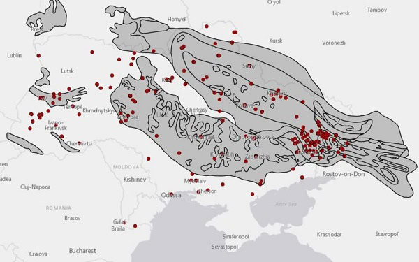
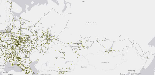
For example, in the left figure below, she writes that it shows “Over 70 percent of the camps in Ukraine, for example, were within a three-mile radius of coal basins,” but the map also shows that… well, most of Ukraine appears to be a coal basin. Fortunately, she did not make the correlation/causation mistake of this as conclusive proof that these POWs were used for labor. On the map on the right, she observes that, “An imported map of Russian rail lines showed that camps fell only on the rail networks of the Russian Soviet republic.” While this could plausibly show that workers were creating goods for transport, it could very well also be out of necessity — after all, these prisoners need to get to the camp somehow. If these maps were presented without accompanying archival evidence, I would be deeply skeptical of what they actually show.
There’s a saying in data analysis that I love, usually attributed to statistician George E. P. Box: “All models are wrong, but some are useful.” And GIS is most certainly useful. I definitely want to go back and play around more with QGIS; I was excited to find some flight data repositories that I could load in to examine airspace and airplane data through visualization. But it is a supplement, rather than definitive proof, to well reasoned and evidenced arguments. We must keep in mind Box’s wisdom: these models are wrong, and we must attend to them with care.
I agree that the value of GIS might be more in suggesting relationships you might not otherwise have seen than quantifying them. Andrew Gelman (he’s a quasi-famous statistician/political scientist) makes the same point about statistical analysis in general: first plot the data and look at it before embarking on a sophisticated statistical test to prove what may very well be a preconceived notion.
The fact that you, with your knowledging in programming and coding, intitally found the program intimidating makes me feel better about my ineptitude. One concerning thing is that (while a historian can twist and misrepresent the past) GIS mapping can unintentionally produce inaccurate pictures of the past. I think I will continue to stick to my archive.
Hi Maddie, I liked your introduction about your father and the map quizzes. I belong to your father’s generation, and I have always loved geography too. I also understand what you mean about the complicated of GIS. Even though I am already familiar with video and photo editing programs, it still takes me time to get used to the layout and tools of a new program. Sometimes I wish programs like QGIS, Blender, and editing software had more standardized designs so that learning a new one would be easier. Of course, I understand that each program is designed differently for its own purposes and to compete with other products.
Maddie, you make some really great points into some of the nuances of the Grunewald article that shows some of the pros and cons of working with mapping software and HGIS. Your insights to some of the challenges with engaging with this software were also very insightful!